Give me back my ClearType
WPF has a separate ClearType rendering system, which is better than GDI’s (mostly because it also does y-direction antialiasing; read more here and in the WPF Text Blog.)
However, there are some situations in which WPF cannot use ClearType, and has to resort to grayscale antialiasing (it cannot render aliased text because of its pixel independent architecture) which comes out pretty blurry for small text sizes, in my opinion.
Here’s when WPF can’t use ClearType:
- Window/Popup AllowsTransparency = true. This creates an HwndSource with UsesPerPixelOpacity = true (i.e. a layered window.) All context menus and tooltips in WPF have this turned on with no trivial way of turning it off. More on this later on.
- Visual (or some ancestor) has a Bitmap Effect. (Sidebar: You should really avoid using those on any complex Visual. They yield the worse performance. If you want a shadow under something, take an empty Rectangle or some other Shape, apply the effect on it and put it under the more complex Visual.)
- Text from another Visual appearing in a VisualBrush.
- Rendering a Visual using RenderTargetBitmap.
- Setting the HwndTarget.BackgroundColor to Transparent (needed for extending DWM glass to client area.)
Also, there are registry settings that can enable, disable or configure ClearType, both system-wide and WPF-specific.
In Vista, ClearType is turned on by default, so WPF also uses it. In XP, however, it is not. And so by default WPF is rendering grayscaled text. From my experience, ClearType is better even on CRT monitors, so when I write WPF applications, if ClearType is off, I display a message recommending to turn it on, and make the WPF-specific registry changes.
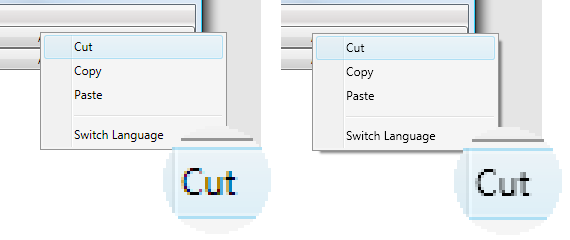
Now, for my woes. Take a look at these screenshots:

The left one is with ClearType, the right one without. I hope the difference is clear. As I mentioned earlier, context menus, tooltips and combo box use the Popup class, which has the AllowsTransparancy set to true. This is hardcoded. The reason for this is obvious: the designers of WPF wanted you to be able to customize these windows as you saw fit. And it can truly be used to do wonderful things (see this styled tooltips example. Quite effortless, if you consider what you had to do to get this done in Win32.) But I think readability is more important in these cases. At any rate, this should be configurable.
Aside from the text issues, layered windows’ performance is much worse than normal windows. Even under Vista, where they are hardware-accelerated, the menu highlight is lagging after the mouse sometimes.
Frustrated a bit, I came up with a somewhat_ dubious_ solution to these issues.
For ComboBoxes and MenuItems, I created an attached Dependency Property, which, when attached to a control, attempts to find the “PART_Popup” in its template and set its AllowsTransparency property to false. Caveats:
- You lose the animation when opening a combo box (slide) or a menu (fade).
- You lose the shadow.
- If you apply a transform, the popup will not match it (Then again, who would want a skewed combo box? But a rotated menu might be useful.)
For ContextMenus and ToolTips, I create subclasses, overrode IsOpenProperty metadata and added an additional changed handler. The Framework Property Metadata documentation states that:
The actual property system behavior for PropertyChangedCallback is that implementations for all metadata owners in the hierarchy are retained and added to a table, with order of execution by the property system being that the most derived class’s callbacks are invoked first. Inherited callbacks run only once, counting as being owned by the class that placed them in metadata.
Either I don’t understand it well or the documentation is wrong, since the method I specified ran after the original method. To solve that, I wrote a class that inherits FrameworkPropertyMetadata and reverses the execution order, so I could create the Popup myself without setting the AllowsTransparency to true. Caveats:
- I use reflection to get to private fields. Yes, I know it’s bad… 😛
- Again, you lose shadows and animations.
- Tooltips have rounded corners by default (at least on Vista) so you’ll see gray 1-pixel dots on the corners. But you can change the tooltip’s default style to get rid of this.
I tried to regain the shadows using cheaper means (CS_DROPSHADOW window class style) but it’s difficult to reach.
You may think I’m crazy to go through all of that just for a few blurry texts, but I think this really impacts the overall readability of my applications.
Attachment: ClearTypeBack.rar